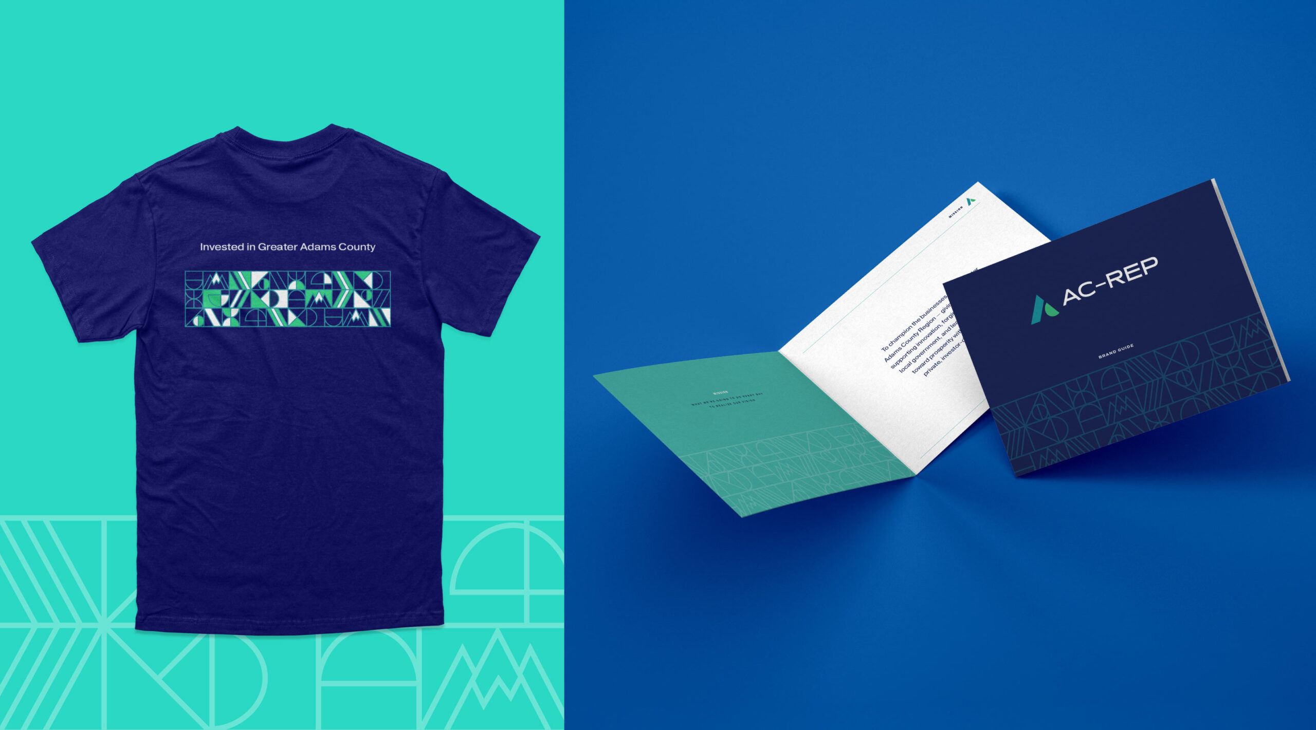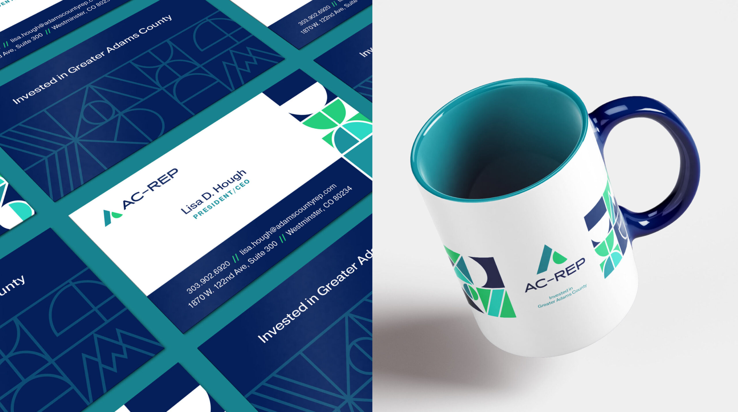
Adams County Regional Economic Partnership (AC-REP) is a private, nonprofit organization focused on championing the businesses and economic health of the Greater Adams County Region. They pour passion, time, energy, and investment into the innovation and growth of local government and businesses — they knew it was time to pour some of it all into themselves.
During a pivotal period of transition, AC-REP turned to AOR for support in elevating its brand identity, through storytelling and visuals. They recognized the need for a refreshed look and feel that more aligns with their strategic objectives, which include retaining and attracting new members, securing funding, and addressing existing negative perceptions.
Recognizing the need to enhance awareness and understanding of AC-REP’s value to its members and community, we initiated a comprehensive evaluation of the organization’s messaging and positioning strategies.
This in-depth exploration focused on two critical areas:
By aligning their messaging with these foundational elements, we aimed to create a more compelling and clear communication strategy that resonates with both current and prospective members.
AC-REP’s new mark and subsequent marketing visuals needed to propel them into the 21st century and better reflect both the new narrative identity and their position in Adams County currently. The brand identity now uplifts both AC-REP and the 10,000 companies and over half a million residents they serve.
The mark is made up of shapes representing how AC-REP is a foundation of support for those 10,000 residents and businesses. The ‘A’ includes a pillar shape representing the people and businesses and a half circle representing AC-REP uplifting those businesses.
We continued the use of these shapes to build out patterns, other collateral, and an entire brand architecture, including all program and event marks.


AC-REP’s new brand launched into the market with a splash. It has ensured they are relevant to their target audience and has set them up well for their future.