Take a look around you. How many logos do you see? Odds are, the answer is probably “Why are you making me count things? I came here to read.” But also likely “A lot.”
More than just a simple pictograph, a good logo encapsulates everything a brand is. A shorthand to trigger thoughts of anything from quality to speed to fun to any other possible descriptor (or, even better, a combination of several) that could build an emotional connection. And that’s why we see them everywhere — they’re quick references that our minds can unpack based on experiences or preconceived notions.
But such a pure distillation can be incredibly hard to achieve. Because even that is just the first step. A logo also has to be distinct. And unique. A logo showing trees might seem perfect for a local park, but how do you know it’s the logo for that specific park? Before pencil ever touches paper you have to find your point of differentiation — the thing that sets it apart — and use that as a cornerstone in your development. It’s one of the reasons AOR puts so much emphasis on our ‘Discoveries’, half-day sessions spent with clients doing deep dives into everything that makes them who they are.
So, how do you boil everything a brand is (and, just as vitally, everything they aren’t) down to something so small, yet so instantly recognizable?

The easy answer is by trying as many things as we can before we start to see ‘the one’ take shape. The reality is there’s no easy template, every brand is different and therefore so is each logo development process.
Before we even put pen to paper there’s hours upon hours of research done. And several sessions with clients. Then some more research. And some more client chats. We need to be sure we understand a brand as well as anyone can before trying to create or evolve its logo.
The great thing about being a team is the opportunity for multiple approaches. Some of us start by getting their first thoughts down into a sketchbook. Others like to walk outside or surf the web, gathering inspiration. Casting a wider net means we never miss out on a potentially great idea.
Then, the development process begins. We see which keywords stick out from our discussions — trying to develop visual metaphors for what we’ve identified as the core of the brand or organization.
Memorable. Ownable. Reducible. That’s the mantra for what a logo needs to be. You have to be a brutal self-editor and ask ‘how much can I take away and still have this be representative of the idea?’. From there, there’s only a million decisions and minuscule refinements to go before we reach the finished logo.
Ideas become sketches. Sketches become thumbnails. Thumbnails get digitized. Colors are brought in. And finally, after iteration upon iteration and a cutting room floor filled with discarded ideas, we’re left with something that we both feel proud of and believe nails the client’s challenge.
Perhaps it’s not surprising that something so vital to a brand’s success is so tricky and arduous to create. But it’s absolutely one of the most important pieces in a brand’s DNA. After all, it is the reflection of everything a brand does and can mean. Not to mention a great way to help promote yourself when space, attention, or time is limited.
Want to talk about your logo or new brand that needs a logo? Let’s chat! Reach out here.
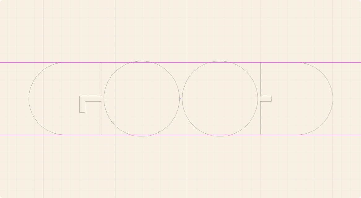
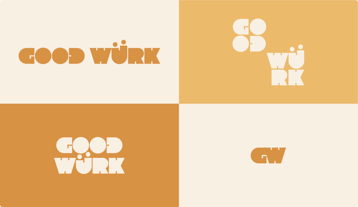
P.S. The examples shown in this Insight Post are all from the development of our Pro Bono program — Good Würk. Which you can learn more about here.