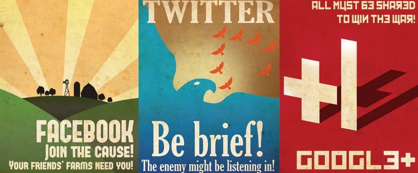
I’m a sucker for anything retro.
I’ve noticed a recent trend among designers and artists to combine a vintage look with current messaging, and I wholeheartedly approve. And, one of the most creative ways I’ve seen this done is through the use of old-school propaganda posters as a platform. They’re fun, colorful, have interesting art, and the propaganda message makes for some amusing and creative copywriting. (A favorite iteration of this trend involves one of the objects of my geek affection, Battlestar Galactica. *cough* TheseMightBeHangingInMyHouse *cough*)
But, since we’re all about not fighting Cylons here at AOR, let’s take a look at something more appropriate to share in this venue …like this: Graphic designer Aaron Wood made some vintage-look social media propaganda posters that rock. And BONUS KISMET, I found them on Twitter, because that is how things work.
Wood has some other really amazing designs as well…and no I don’t know him, nor did he pay me to say this. He’s just a really talented dude who knows how to make things this girl loves. So Say We All.
Let me know what you think!
See our recent work here. And don’t hesitate to reach out.