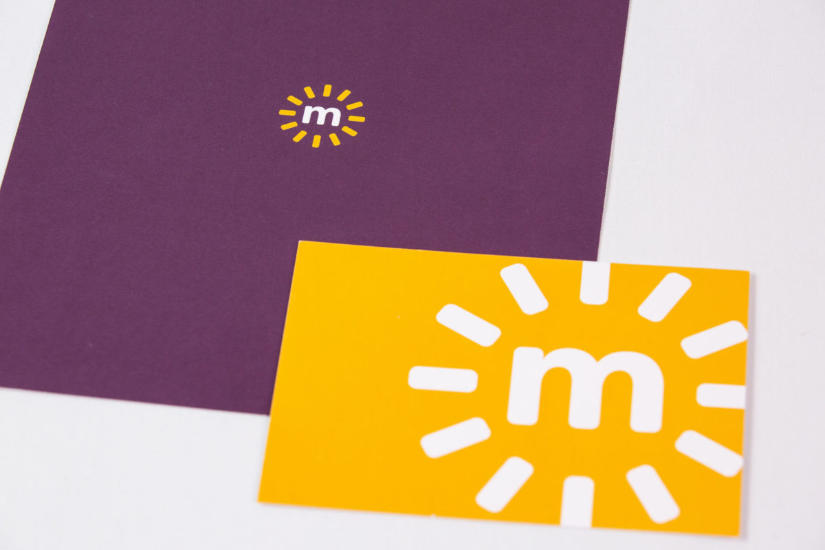
In this age of online everything, your stationery—your business card, envelope, and letterhead—is likely to be the first tactile encounter a customer or client will have with your brand. So, it’s important to get it right if you want to make an impact. Here are a few useful tips on stationery design and production that will help you stand out.
Stationery sizes are pretty standard in the U.S., but that doesn’t mean you can’t change things up a little. Add some interest to your business card with a different size, shape, or die cut (and please don’t worry about the 14 people who still use a Rolodex—they’ll manage).
Instead of folding your letterhead in thirds and stuffing it in a #10 envelope, the way everyone else does, design it to fit a fairly less common envelope size. You could consider international paper sizes, such as an A4 letterhead, which can be folded in half to fit in a C5 envelope. It’s not a huge change, and it’s less handwork, but it will help differentiate you from the sameness of corporate correspondence.
Paper is important. It’s an easy way to add texture, personality, and gravitas to your materials. And it can help to reinforce your brand. Your tech startup may benefit from a paper that’s sleek and super smooth—like the digital realm in which it operates—while your sister’s organic muffin shop may be better served by a more crafted, natural, textured paper. Think of the feel of the paper as an extension of your brand experience—because it is.
One aspect that’s often overlooked when choosing papers for stationery is the weight (or thickness) of the paper. Your logo and letterhead design deserves better than to be run on the office printer on cheap, bulk paper. And a flimsy business card is about as confidence-inspiring as a limp handshake. So, when in doubt, go heavier.
OK. So, what’s heavy?
Paper companies use a variety of methods to describe paper weight, such as pounds (per 500 sheets of a basic sheet size), points (1 point = 0.001 inch), or GSM (grams per square meter). But you don’t need to know any of these details, and paper manufacturers can’t seem to agree on a preferred weight designator anyway, so your best bet is to ask to see samples.
If you’re still unsure, good baselines for stationery paper weights are 80 to 100 lb. Text for letterhead (with matching envelope). For business cards and note cards, 100 lb. Cover should be the minimum.
Colored papers can add richness and greater dimension to stationery design, but there are some things to consider before going full-on peacock. That bright red envelope matches your brand color and will command attention with respect to the rest of the recipient’s mail, but how will your logo look printed on it? Some of the ways around that are opaque metallic or white inks, blind embossing, and colored foils. There are also digital presses that can print vibrant, unaffected color on colored paper—and we just happen to have one.
When people start a business, they don’t set out to blend in. So, it’s curious that so many follow convention in designing stationery when it may be their first opportunity to wow a potential customer with design, color, or texture. Let our seasoned print professionals help you make your best first impression with some stellar stationery.
See our recent work here. And don’t hesitate to reach out.