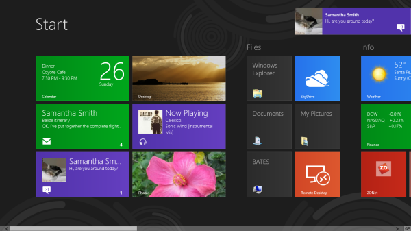
With Windows 8 and a Microsoft tablet PC releasing this past weekend, the public has gotten their first true look at Microsoft’s grand vision of a design language. The interface, originally dubbed “Metro UI,” has been in use on the XBox 360 for a couple of months, but the release of Windows 8 has Microsoft unifying the interface design in all Microsoft products, even going as far as doing away with the previously integral “Start” button, favoring the core component of Metro: a boxy, colorful, scrollable dashboard.
Metro comes at a pivotal time for Microsoft. For several years, iOS–the highly consistent interface used in Apple products–has by far topped the mobile and tablet markets. Apple’s devices are touted for their ease-of-use and flat-out beauty, while Microsoft has historically been seen as stodgy by comparison.
But that’s changing now. Metro uses highly saturated colors and actual contrast! Negative space abounds! They dare to use solid colors in an age where gradients are king! Typography used throughout the interface is almost needlessly huge and decidedly modern! Each box in the doggedly strict grid actually displays useful information! The animation on each element is snappy and professional!
Each of these conscious design decisions in Metro ties back to a major push by Microsoft to offer a legitimately useful, visually distinctive alternative to Apple products, and this is a fantastic start. The walled garden is not as readily apparent here as it is in Apple’s iOS, and it allows users to quickly customize any given Metro grid while keeping it pretty.
Beyond the “Apple vs. Microsoft” angle, however, Metro represents a significant milestone in the technology world. With mobile interfaces using touch screen technology becoming more and more prominent, the concept of convergence is being heavily discussed in tech circles. That’s Metro’s blessing and curse: it’s forward-thinking and designed with touch interfaces in mind, but implemented on devices that don’t yet utilize them. Although that fact has soured some people on early releases of Windows 8, it nonetheless shows that Microsoft is still capable of–and committed to–innovation.
Have you played with a Windows Phone or Windows 8 yet? What are your thoughts?
See our recent work here. And don’t hesitate to reach out.